

For years, Membean has been a staple of Chaminade English classes. It has never been loved, but it has always been there, a utilitarian tool that has likely helped at least one student expand his vocabulary. One logged in, did his fifteen minutes, checked his progress, and left. Simple!
The world we were raised to survive in no longer exists. Recently, Membean unveiled a new, hideous dashboard. What was once familiar is now foreign. What was once functional is no longer such.
The old homepage wasn’t perfect. Nobody was writing poetry about it. But it worked, and it was coherent. It respected our lack of free time as students and the fact that our only desire when logging onto Membean was to do what was required of us—there was nothing else that we cared about.
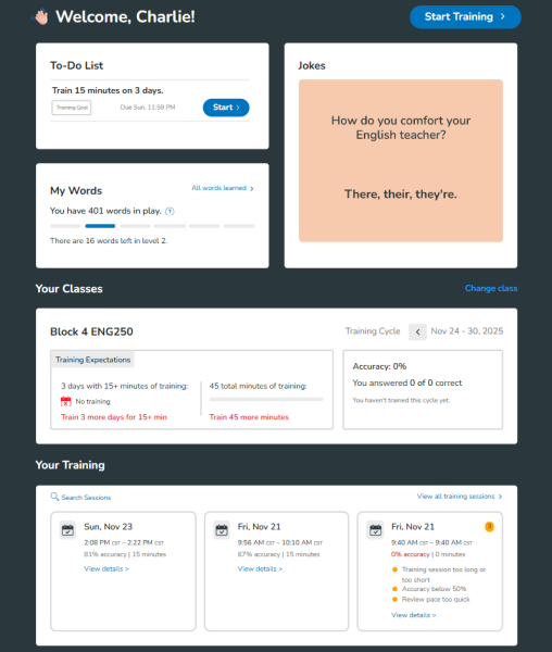
Now, one would expect assignments, what students are logged in for, to be at the top. But no—that makes too much sense. That’s reasonable. So naturally, now we are greeted by an onslaught of ginormous, useless images—trivia, challenges, would-you rather questions, jokes, etc. Guess what? Absolutely no one cares about any of this! It’s like walking into what you think is the DMV, only for the interior to be a Chuck E. Cheese. You wouldn’t really want to be at the DMV, but you’d also wish to resolve what brought you there, not play arcade games.
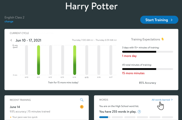
On top of assignments being buried, so is one’s progress that week. It’s like they want to keep you down! And don’t even mention the quizzes. Starting at the top of the website, with my fingers on the bottom of my mousepad, I had to scroll all the way to the top three times in order to reach the bottom, where they are located. Scroll once. Scroll twice. Scroll thrice, and maybe, just maybe, you’ll be able to see that which was available to you the moment you loaded into the old dashboard! Here is an image of the redesign, zoomed out significantly. Look at how much space is needed to convey the same amount of info!
One student had some particularly compelling and devastating words regarding all of this: “It is bad.” Another peer of mine, nicknamed “The Membean” for his proficiency in the English lexicon, said that the “transfiguration” was a “malfeasance” and that he finds the change in interface rather “monotonous.”
I wrote an email to Membean, signed by 15 of my peers, begging them to undo this catastrophic shift. I was a bit dramatic, but a travesty such as this—a total collapse—calls for dramatics. Membean’s response essentially boiled down to, “You’ll get used to it.”
We’ll see about that.
One student stated in his own email, “If I were not required by the school to use Membean, I would entirely avoid the platform.”
In sum, this redesign did not make the website better in any way whatsoever. It is objectively, unambiguously, and ridiculously worse.
To the people behind Membean: we all make mistakes. I do not hate you, and, as I expressed in my email, I appreciate what you are doing. But please, for the good of humanity, fix this.